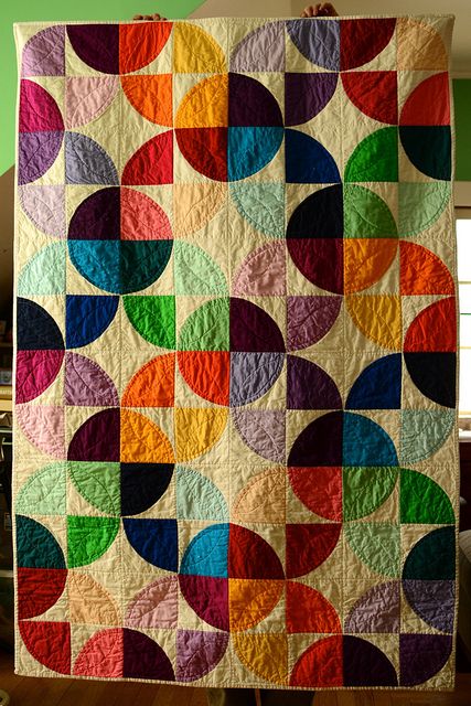
Tessellations! By Jean Larson

As promised, my friend Jean Larson has written a tutorial on tessellation quilts.  I hope you enjoy it as much as I did!  –MJP

Tessellating designs make me happy.  Tweaking those designs is even more fun.   I want to share the joy of starting with a very, very simple design and watching it blossom.  My inspiration comes from this web site:  http://gwydir.demon.co.uk/jo/tess/

Start with a simple gridded block and create a light/dark design.  Here, I’ve started with a 3 x 3 grid.  Then re-color the same block with the lights and darks reversed

.The grid lines are only for design purposes, and each block can be constructed with a single square block with 2 corner triangles attached using any method you prefer.

Here are some design possibilities…Quilt_1A simple “cat head” quilt using only 2 colors.

Different looks can be achieved with variations in the color placement.

Blocks can be inverted and turned for even more quilt designs.

Just imagine all the possibilities with color in these!!!!!

It’s even more complex when you design with a 6×6 grid.  Here are the positive and negative versions of another block.

These blocks can be constructed using half-square triangles integrated with larger fabric pieces.  If these blocks were to finish at 6 inches by 6 inches.  The center column on each block would be a single 3.5 inch wide by 6.5 in long piece of fabric.  The side strips would include some half-square triangles.

A couple of the quilts that can be made:

Looks like spools, some gray, some white, all standing up.  Same quilt with alternate blocks turned a quarter turn yields a different  clearly recognizable tessellation.  Reminds me of tessellating doggie rawhide chews 😉

Now back to the spool quilt from above.  The “thread” areas have been colored in.  No blocks have been turned.

Jean spool 5This shows the power of color and value (lightness and darkness).   The colored part, being next to the gray and being closer in value to the gray, unites those parts of the block, and gives the illusion that we have all gray spools on a white background, some standing up, some lying down.

I hope these examples can be the seeds to sprout some design experimentation with tessellating shapes.

  1. Start with 2 square grids
  2. Create a positive design, and its negative design
  3. Alternate them in a quilt layout
  4. PLAY!
  5. And play more with color!

Happy Quilting (and Designing)!!   –Jean Larson


“Found” Designs

I took several pictures on a recent trip to illustrate “patterns and palates” I found along the way–or “designs and color schemes” if that has more meaning (though less alliteration).

The first thing I noticed is that, although I think of the Southwestern U.S. in terms of bright colors–turquoise, orange, bright blue–it really is pretty monochromatic, at least in midwinter.  And a lot of the man-made colors that started out vibrant have bleached considerably in the bright sunlight.  So here are a few patterns and color schemes I found interesting. Whether they ever make it into quilts remains to be seen!

These patterns found around the hotel definitely have some possibilities for both piecing and quilting.  And they have so much grey they must be modern 😉

These color schemes were more what I was expecting. But the colors were found more in man-made things than in nature except for the bright sky.  In that picture of the blue building, that IS the sky you see in the top right corner!

There were some beautiful patterns in nature.  The colors were lovely, but were subtle rather than bright except for that SKY!

I especially liked the strips of waterproof nylon cloth, all finished like flags, that were used to screen a construction site we passed.

Lots of great things to see, and this was just a single walk!

What have you seen lately?


First Finish

Metro Hoops Quilt

Metro Hoops quilt made by Allison at Cluck, Cluck, Sew

Inspired by the beautiful Metro Hoops quilt Allison showed over at Cluck, Cluck, Sew, I mentioned the Quick Curve Ruler as something I wanted to try in a recent post.  Here’s a picture of her quilt so you can see what inspired me.

My clever son-in-law gave me the ruler for Christmas, and as soon as we got home I tried it out.  As always, I learned a lot. Certainly the Metro Hoops pattern is a nice modern alternative to the traditional wedding ring quilt.  What I wasn’t prepared for was the fudge factor required to make it work.

modern quilt block

My first Metro Hoops block

It made a really cute block, but then my inner perfectionist kicked in 😦   The block required a lot of “easing in” along the seams to make the points match up. *(You can skip to the reason why at the end of this post, if you like.)

Luckily, I almost never cut out a new quilt completely before making a test block.  After making one block for this quilt, I decided 5 hoop blocks was my limit.  The blocks really are quicker and easier to make than they look, so I got the 5 done in a few hours. They are nice big blocks (finish 15″) so I had a good start on a baby quilt.

I drew an approximation of the block with my EQ7 program and came up with this layout:

My EQ7 layout for the Metro Hoops blocks

My EQ7 layout for the Metro Hoops blocks

Another half day to make the alternate blocks, then a day to put it together, make a back, and quilt it–and voila!  The first finish of 2015!Metrol Hoops baby quilt

About the Quick Curve ruler:  the women who designed it have lots of cute quilt patterns on their site, so it’s worth checking out.

*BUT, if I make metro hoops again, I’ll modify the directions to make it more to my liking.  I think the basic issue here is that the single curve provided by this ruler is used for both the concave and convex curves in the quilt.  That means there is no seam allowance to make the curves match nicely.  The project is “saved” by the fact that the curve is less than a quarter circle, so it’s possible to fudge the sewing to make it go together without adding seam allowances.  It does work, but don’t think it’s going to fit the way pieces cut from most curved templates do.  If you decide to do it, be forewarned to relax and get rid of the inner perfectionist!

Quick Curve Ruler quilt

Happy new year!


5 Favorites of 2014

1. Favorite quilt show I attended: Vermont Quilt Festival.  You can see some quilts from it here and here.  And here again is a detail of one of my favorites:

big stitch quilting

Detail of Fill the Void by Cinzia Allocca, at Vermont Quilt Festival 2014

2. Favorite thing about blogging: Meeting new friends, both in person and online.  Read about a couple of them here and here, if you like.
3. Favorite modern quilt trend: some textures and low-volume prints (those that show more background, having the prints smaller and farther apart)  to get us away from all solids, all the time.  Some of my favorites include these from Carolyn Friedlander:

and these from Alison Glass:Alison

4. Favorite new (to me) quilt tool: Frixion pen.  It comes in lots of colors and erases when you iron over the markings.  Only drawback I’ve found is that you can’t see the mark on dark fabric.  For that I still love my chaco liner with yellow chalk.  Show below:  chaco liners on left, frixion pens on right.

5.  Favorite lesson learned:  I’d rather see my designs in print than at quilt shows.  Yes, I entered several shows and contests, and I won something.  But my favorite quilt of the year (from those I made) was the one that was published in Modern Quilts Unlimited.  So here is a picture of it again.Zippy Star 2

And what were your favorites of the year?

Michael Miller CHALLENGE

I like a good challenge as much as the next woman. In fact, I’m happiest if I learn something new from each project.  So I was happy to accept the current Michael Miller/Modern Quilt Guild challenge using Michael Miller’s (MM’s) spring pastel solids.

Michael Miller challenge

Michael Miller sent this package of Cotton Couture solids to all contestants.

Like a lot of modern quilters, I don’t use pastels much.  That’s the first reason this was a challenge.  I decided that, since black is a great background color for brights, something dark but not black would be a good background for pastels.  So I ordered cotton couture in indigo, eggplant, grey, and charcoal to give me a choice.  After trying out each one with the fabrics provided by the MM people, I chose charcoal–always a favorite color for me!

The next challenge was trying to find somewhere I could buy additional yardage of these particular fabrics.  Most places that carry Cotton Couture were out of them!  So I decided I needed to design something using just what came in the package, plus my charcoal background 🙂

I designed the quilt with Electric Quilt 7 (EQ7) as usual, so I had an easy way to try out lots of different ideas.

I’m a big fan of star blocks, so I experimented with the 16-patch star often called Ohio Star, and finally settled on this version, in which the block is divided into four quarters that are rotated and combined in various ways.  Here’s the EQ drawing:MM4

And here’s a picture of the almost-finished quilt.  Binding it is an additional challenge, since I don’t want the binding to show but I want the corners to be square (which is difficult if I do a pillowcase binding).  I’m counting this as my November finish 😉

My quilt for the Michael Miller/Modern Quilt Guild challenge

My quilt for the Michael Miller/Modern Quilt Guild challenge

And please check out my Quilt Alliance donation quilt on Ebay.  Here‘s the link.  I’m so happy that it’s doing well!  If you don’t know about the Quilt Alliance, check them out through this link.


Your Inner Designer: 3 Formulas for Modern Quilts

It seems to me that, when learning a new skill, there is often a “formula” or basic idea that, once mastered, provides a way into successful practice of the new skill.  So here are 3 ideas for you to try.  See if one of them helps you create designs that you like.

1. Use lots of “negative space”, and start by making this background space in a shade of gray.  (The person who brought my attention to this “rule” of modern quilting has asked to remain anonymous 😉 )  Here are some examples, but I’m sure you know of lots of others:

modern quilt

Shades of Gray by Terry Aske. 2nd place award in the Modern category, Quilts Canada 2014

modern quilt

Found on lilysquilts.blogspot.com

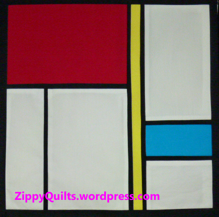
2. Another common way to “design” a modern quilt is to make it an obvious take-off from a piece of 20th Century art (or occasionally more recent art).  My design below is by no means an exact copy of any of Piet Mondrian’s work, but it certainly is an imitation of him:

modern quilt design

Thanks, Piet! by Mary  J. Puckett

Sometimes I do see modern quilts that are a direct imitation of an artwork.  However, my preference is to look at a lot of work by one artist, or by a group of similar artists, then close the book and draw something original that “references” the works I’ve studied.

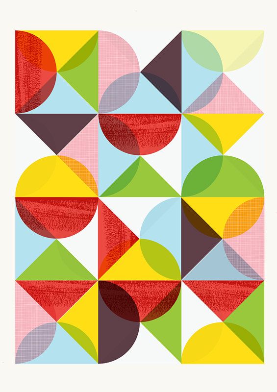
For example, here’s a print I found at an Etsy shop called “Handz”.  Compare it to the quilt just below it.  It’s not a copy, but it could have been based on the print.  Or they could have both been inspired by another source altogether.

modern art print

Mid Century Modern Art print found at Handz on Etsy

modern quiilt

finished – modern drunkard’s path by m_soto on Flickr

3. Just start with modern fabric.  One of my favorite “modern” quilters is Rita at Red Pepper Quilts.  Many of her quilts are traditional designs, but she uses bright, modern, fabrics and her quilts always look fresh and modern to me.

modern quilt

Spools and Nine Patch Quilt by Rita at Red Pepper Quilts

Here’s a detail of another of Rita’s quilts:

modern quilt

Detail of a quilt by Rita at Red Pepper Quilts

Give some of these ideas a try, and let me know what you come up with!

Your Inner Designer 6: Copy Somebody Good!

Truly original ideas in design are really, really rare  More often good designs are inspired by other good designs, and most designers start by copying other people.  There’s nothing wrong with that–just give credit!

Door with art glass window

Glass window, designer unknown

For example, here’s a door I admire in a friend’s house.  It got me thinking that it would be nice to make her a table runner with a design similar to the glass in the door, especially since the dining table is right by the door.  I may start out by copying the design, but my table runner won’t be an exact copy.  I want it to be obviously inspired by the door, but I probably couldn’t make an exact copy even if I wanted to.  And I’m not going to sell it as my own “original” design without reference to the door, either.

Here’s the first attempt:Craftsman inspired table runnerThat may be obviously inspired by the door, though in fact both are inspired by Frank Lloyd Wright and Craftsman styles of design. If you don’t know much about those styles of design, Google them.  There are many similar designs to be found, so I can make LOTS of designs of this style without copying any of them.  Here’s the second try:Craftsman style table runner

This one has a little more detail.  Another master of this style, popular in the early years of the 20th Century, was Charles Rennie Mackintosh.  William Morris textile and wallpaper designs were the same historical period, and you may have seen Moda’s extensive line of William Morris-inspired fabrics.

One last try:table runner

So go look at some books on the history of design (the history of advertising works too) and make some designs inspired by what you see.  It’s a good starting place when you think you don’t have any ideas, and you’ll eventually come up with something your really like.  Then it’s time to make a quilt!

Here are the first 5 posts in this series:

Your Inner Designer 5: A Program to Make Your Own Palette!

Quilt Design 4: Choosing Your Color Scheme

Your Inner Designer 3: New Blocks From Old

Your Inner Designer 2: Many Block Arrangements

Find Your Inner Designer, Part 1

10 Quilty Secrets

Several of the blogs I read have recently revealed “10 Quilty Secrets” and I thought it sounded like fun, so I’m playing along. If you would like to see some other bloggers’ secrets, here are the links: The original post seems to have been at 13Spools.com, and the idea has been picked up by several blogs I follow, including Catbird quiltswombat quilts, and Christa quilts.

And so, here are my 10 Quilty Secrets:

1. Although I’m participating in Marti’s UFO (unfinished object) finish-a-month this year, I had FAR MORE than 12 UFOs at the beginning of the year. Oops, still do! Here’s the August finish, a quilt for Ronald McDonald House made from orphan blocks:August-finish

2. My nearest LQS (Local Quilt Shop) is an hour away, which I take as an excuse to have a good stash at all times 😉

3. If I start a quilt and don’t like it for some reason, I abandon the plan and turn it into something else–another quilt design, a table runner, whatever.

4. And sometimes those I-don’t-like-this projects just become long term UFOs 😦

5. In my world, a good quilt is a fast quilt.  I’m not patient enough for the zillions of little hand-pieced hexies, for example.cartoon hexie

6.  For that matter, I DON’T EVEN LIKE hexies!  Yikes!

7. I value good design in quilts and in other useful objects.

8.  I LOVE to learn new techniques and try new things, so I take lots of classes  Even if they seem like stuff I could do easily without a class I always learn something.

9. We’ve moved a lot, and one of the best ways I’ve found to make new friends is to join a local quilt group.

10. I think every quilt needs a little purple!

So, what are some of YOUR quilty secrets?

3 Perfect Ideas

Pieced quilt, circles

The Perfect is the Enemy of the Good

1. The perfect is the enemy of the good.

I made this quilt a long time ago to practice circles, and the quotation that inspired it came to mind recently when I was debating which quilts are “good enough” to be submitted to juried shows.  It probably is obvious that the design above is more interesting than the “perfect” one shown below:

pieced quilt, circles

Perfect Isn’t So Good

2. “Perfect” is well enough done that you are satisfied when you look at it, but not so over-worked that you’re sick of quilting by the time you finish it.

To make a perfect quilt, It helps to start with:

  • The right pattern for your skill level
  • Fabric you love
  • Techniques you enjoy (e.g., paper piecing, applique, whatever)
  • The right tools, well maintained

3. You may be more capable of “perfect” than you think.  It helps to have friends who keep you honest!  I recently had trouble making my seams line up on a medallion-style block and my friend Jerri said, “You’re too good a quilter for that!  You just don’t want to bother!”  Oops, she was right.

And here’s a book that helped me with “perfecting” my blocks:  

Sneaky Piecing by Beth Ferrier

I found this book with lots of tips on how to improve piecing accuracy and got a lot better with just a little practice!

I recommend the book if you want to improve some of your skills, too.

pieced quilt block

Swap Block–88 little squares!!!

And look at this lovely swap block with the corners all matched up!  It isn’t perfect, but it’s good enough 🙂

Your Inner Designer 5: A Program to Make Your Own Palette!

I mentioned Design-seeds.com in my last post as a good color resource, but there are SO MANY others!  Today I’m going to tell you about just one, and I hope you’ll check it out and enjoy it.  Others to come in the future!

—Today’s Feature: Palette Builder—

screen shot from Palette Builder

Here’s a palette from a picture I took

It’s free!  It’s easy to use!  Anne Sullivan and friends have a fun app accessible from their blog at Play-Crafts.com.  Just go to the blog, choose PaletteBuilder from the menu along the top, and you’re IN.  You can upload a picture of your choice and the app gives you a palette that looks a lot like the ones on Design Seeds with two fun differences:  PaletteBuilder uses YOUR photo, and it gives you colors in Kona Cotton that closely match your palette!

screen shot from PaletteBuilder

Palette made from my quilt

But let’s say you love the palette in my “Study for New Mexico” quilt and want to use it for a quilt of your own.  Just find the quilt on my blog, load the picture into PaletteBuilder, and there you go.  The Kona cottons are chosen for you!

screen shot from PaletteBuilder

PaletteBuilder may “see” individual colors better than your mind does

This program may be especially helpful with a picture like the one above.  First, I wouldn’t have thought to put those shades of lavender in there, but I’m pretty sure they would show up well as shadows if I were converting this picture to a landscape quilt. Second, if you’re working on a desktop computer instead of an iPad you can move some of those little circles to sample parts of the picture that might have been left out (like the purple crocus in the top picture.)

So if you have a photo with lovely colors that you would like to see in a quilt, you can start here for your palette.  Now, go have some fun!

Here are the previous posts in this series (click on the title to go to the post):

Quilt Design 4: Choosing Your Color Scheme

Your Inner Designer 3: New Blocks From Old

Your Inner Designer 2: Many Block Arrangements

Find Your Inner Designer, Part 1