When attending the Mid-Atlantic Quilt Festival this spring I took a class with Cindy Grisdela and attended her lecture about color. Both were worthwhile.
Cindy’s class was based on her Full Wild quilt, which she entered in QuiltCon. Here’s a picture of her with the quilt, taken from her blog:
When I got home I wanted to let most of the blocks I made in class rest for a while, but I did make a small wall hanging with one of them. It’s called Drip, and I’m not crazy about it but I just had to do something with one of those blocks!
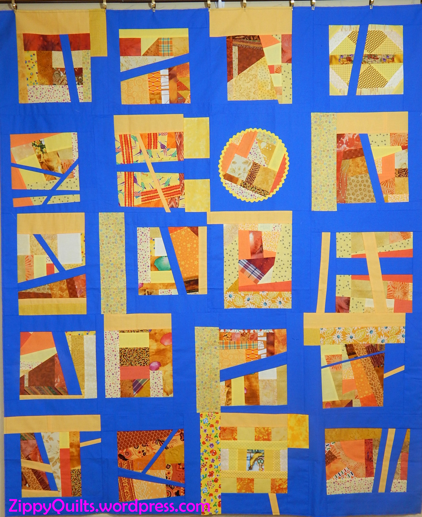
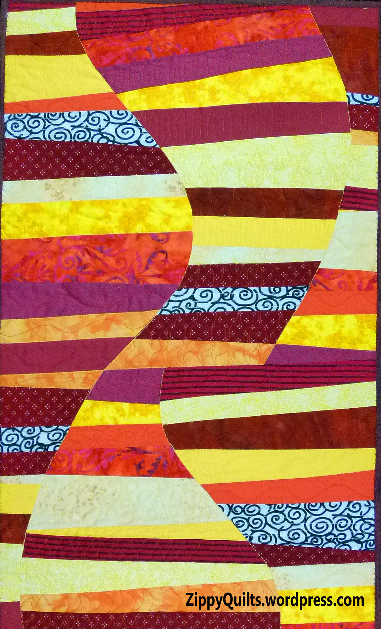
The rest of the blocks I put away because I want to consider what other colors to add. My usual problem is using TOO MANY colors, so I tried to restrain myself. Now I want to add more colors. Here’s a picture of some of the blocks just before the blocks were put away–they aren’t joined yet.
To be continued.
In her color lecture, Cindy suggested making a color wheel, saying it would be interesting to see what you had in your stash. Here’s my snapshot of her color wheel.
When I recovered from the recent quilt show (Heart of the Triad, blog is here), I decided to make a more elaborate color wheel. I drew it in EQ8 and printed templates from my drawing.
This was a fun project, AND I had all of those fabrics right here in my stash! I couldn’t resist using the light grey Tula Pink fabric with all the fun colors as background. The color wheel finished about 18″ square.
Anyway, I enjoyed Cindy’s lecture and her class, and I recommend both if you have the opportunity to attend.