Ultraviolet

The Pantone company is an international organization (though based in the U.S.) that defines colors so that they can be reproduced exactly for printing and industrial uses.  Since 2000, the company has chosen a “color of the year”.  The 2018 color, announced this past week, is “ultraviolet”.  Here is the picture of it from their press release.  You can read the whole press release here.

Pantone publishes many color references, and I have one of their books of suggested color combinations.  I love looking at it, but in reality I choose my color combinations based on what looks good to me.  The book is fun anyway, and certainly I could use it if I ever get “stuck” on finding a color scheme.  You can see information on my book and look at some of Pantone’s other resources here.

I’m sure many of you are well familiar with the Pantone color system.  If you aren’t, browse their website just for fun.  And keep an eye out.  I’m always interested to see which industries seem influenced by the Pantone color of the year and which do not.  Will we see an immediate increase in the availability of purple fabric?


The Modern Sampler Continues

These next two blocks were made from inspirations I found on Pinterest (yes, I love Pinterest!)  The first I simply copied because I loved the colors and their arrangement in the original artwork by Richard Paul Lohse.

Modern Quilt Block

Quilt block based on the work of artist Richard Paul Lohse

Here’s a drawing of how I constructed this block, with measurements, if you want to copy him, too.  There are 4 units, each 4″ finished (4-1/2 inches for each unit before joining) so that the entire block is 8″ finished.  I’ve marked the size to cut each piece on one of the 4 units, assuming you can take it from there 🙂

modern quilt block

Layout for block based on art of Richard Paul Lohse

If you look up the artist Richard Paul Lohse, you’ll see that a lot of his designs would make terrific blocks or whole quilts.  Great sense of color!

The second block was made from a tutorial I found at a website called Piece By Number and you can find the free pattern on her site here.

modern paper pieced block

Circle of Geese block made from a pattern at PieceByNumber

This block was easier than it looks thanks to paper piecing.  I enjoyed making it, though I feel no need to make another right away!

I think these two blocks have a lot of ZIP for the relatively little amount of effort they required.  The Lohse block depends very much on choice of color, so be sure to lay out the fabrics and look at them a while before cutting.  Have fun!

“Found” Designs

I took several pictures on a recent trip to illustrate “patterns and palates” I found along the way–or “designs and color schemes” if that has more meaning (though less alliteration).

The first thing I noticed is that, although I think of the Southwestern U.S. in terms of bright colors–turquoise, orange, bright blue–it really is pretty monochromatic, at least in midwinter.  And a lot of the man-made colors that started out vibrant have bleached considerably in the bright sunlight.  So here are a few patterns and color schemes I found interesting. Whether they ever make it into quilts remains to be seen!

These patterns found around the hotel definitely have some possibilities for both piecing and quilting.  And they have so much grey they must be modern 😉

These color schemes were more what I was expecting. But the colors were found more in man-made things than in nature except for the bright sky.  In that picture of the blue building, that IS the sky you see in the top right corner!

There were some beautiful patterns in nature.  The colors were lovely, but were subtle rather than bright except for that SKY!

I especially liked the strips of waterproof nylon cloth, all finished like flags, that were used to screen a construction site we passed.

Lots of great things to see, and this was just a single walk!

What have you seen lately?


Your Inner Designer 5: A Program to Make Your Own Palette!

I mentioned Design-seeds.com in my last post as a good color resource, but there are SO MANY others!  Today I’m going to tell you about just one, and I hope you’ll check it out and enjoy it.  Others to come in the future!

—Today’s Feature: Palette Builder—

screen shot from Palette Builder

Here’s a palette from a picture I took

It’s free!  It’s easy to use!  Anne Sullivan and friends have a fun app accessible from their blog at Play-Crafts.com.  Just go to the blog, choose PaletteBuilder from the menu along the top, and you’re IN.  You can upload a picture of your choice and the app gives you a palette that looks a lot like the ones on Design Seeds with two fun differences:  PaletteBuilder uses YOUR photo, and it gives you colors in Kona Cotton that closely match your palette!

screen shot from PaletteBuilder

Palette made from my quilt

But let’s say you love the palette in my “Study for New Mexico” quilt and want to use it for a quilt of your own.  Just find the quilt on my blog, load the picture into PaletteBuilder, and there you go.  The Kona cottons are chosen for you!

screen shot from PaletteBuilder

PaletteBuilder may “see” individual colors better than your mind does

This program may be especially helpful with a picture like the one above.  First, I wouldn’t have thought to put those shades of lavender in there, but I’m pretty sure they would show up well as shadows if I were converting this picture to a landscape quilt. Second, if you’re working on a desktop computer instead of an iPad you can move some of those little circles to sample parts of the picture that might have been left out (like the purple crocus in the top picture.)

So if you have a photo with lovely colors that you would like to see in a quilt, you can start here for your palette.  Now, go have some fun!

Here are the previous posts in this series (click on the title to go to the post):

Quilt Design 4: Choosing Your Color Scheme

Your Inner Designer 3: New Blocks From Old

Your Inner Designer 2: Many Block Arrangements

Find Your Inner Designer, Part 1

Quilt Design 4: Choosing your color scheme

Of all the things people think they need help with, color is mentioned most often. Indeed, color can be complicated if you want to make it that way, but my preference is to make it simple. So here goes…

quilt design

Example 1: Purple Quilt

A good starting place is your favorite color. You don’t have to think too much about what that is. So start with your favorite color and then add colors that you like to see with it. Never mind that stuff about analogous color schemes being restful and complementary color schemes being lively. Yes, they are true, but if you do it that way you’re likely over-thinking it. If YOU like the color scheme, then go for it!  I love purple, so that’s what I chose for this first example.  I like gold with it, and the thought process was “I like gold with it so I’ll use it” rather than, “Gold is complementary to purple so I’ll use it.”  However, if knowing it’s complementary helps you, by all means use that framework.  I chose a grey background fabric because grey is “good this year”, as my Mother would have put it.

But let’s assume you want a color scheme kind of worked out in advance.  A common piece of advice is to pick a print as your feature fabric and then choose your coordinates from the colors in the feature print. That works fine, but it assumes you want a multi-color print as the focal point of your quilt.

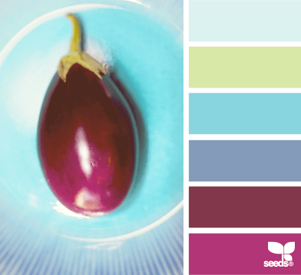
One of thousands of color schemes all ready to use at Design-Seeds.com

One of thousands of color schemes all ready to use at Design-Seeds.com

There are lots of other ways that work at least as well. Color schemes are everywhere you look, and they’ve already been worked out by many design experts, from Mother Nature to New York City advertising specialists. Flip through a favorite magazine and choose an ad with colors that appeal to you. Take a snapshot of something pretty and use the colors you see there. Go to design-seeds.com to view thousands of color combinations.  You can subscribe to a free daily e-mail featuring some of them. Start a Pinterest board where you save color combinations that appeal to you. Above all, have confidence in your own judgment: If YOU like it, that’s good enough!

modern quilt

Color scheme is from a visit to southern New Mexico

Now, go practice by finding some color schemes you like and designing quilts with them. As always, designing on paper counts!  And if this wasn’t enough information about color to suit you, don’t worry–I’ll be saying lots more later!

A Few Internet Ideas

A good while back I listed what I thought were some helpful hints for quilters, but there were too many to fit into a post of the length I like.  So, here are a few more, these related to the internet:

Colors:  If you want some new ideas about colors and palates, subscribe to Design Seeds (Design-Seeds.com) to get free palates delivered to your mailbox every day.  It’s a great inspiration!  Here’s an example of the type of thing they send every day:

street hues

Keep track of internet ideas:  I use Pinterest (www.pinterest.com) to keep track of things I find on the internet, from quilts I want to see again to inspiration and color trends. If you like, you can go to my page (http://www.pinterest.com/mjp28723) and get an idea of how it works by browsing my boards.  Here’s a picture of the front page of one of my boards:

Quilt Ideas

Quilt Ideas / by Mary Puckett

56 Pins

Search colors:  Use Pinterest to keep up with color trends.  By putting “Pantone colors 2014” in the search box, you will get an array of palates predicted to be popular in the next season. The Pantone company provides color standards for the advertising industry but also is at the forefront of color predictions.  You can also Google “Pantone color of the year” and similar phrases to get interesting results.  Here’s a pin of the pantone color of the year 2014, just from putting the words in the Pinterest search box:

PANTONE Color of the Year 2014 - Radiant Orchid decor

PANTONE Color of the Year 2014 – Radiant Orchid decor

So, go have fun on the internet!