This quilt was inspired by all the fun text prints I have collected and also by the desire to make something new as a sample for teaching curved piecing.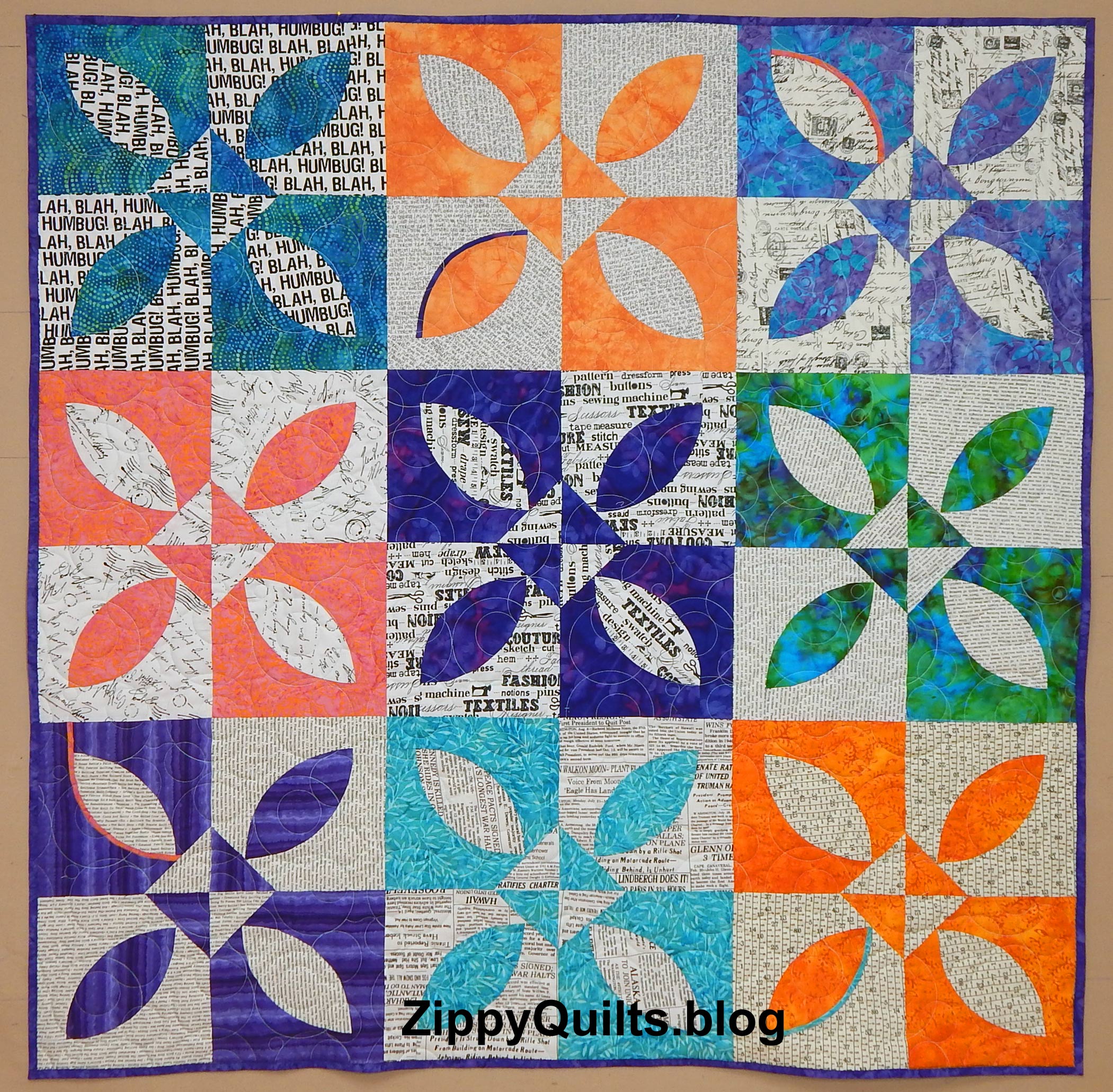
I used batiks from stash for the colors and I love the combination. BUT combining batik fabrics, which are lighter weight, with the printed fabrics was a bear! I do not recommend it. Ordinarily this block is fairly easy to piece, but this combination made it difficult. Another doggone learning experience 😀
I did put in a few of my trademark tiny strips of color:


The templates I used are from Back Porch Designs. I’ve been pleased with them and think they are reasonably priced. This is not an affiliate link, but you can find them here if you’re interested. The quilt block used here is a slight modification of a pattern that came with the template.
And here is the back! Notice the cute “bubble” quilting pattern 🙂
Quilt Stats: Summertime
Finished size: 47″ square
Fabric: batiks and text prints, all from stash; backing is a Windham print
Made by: me
Quilted by: Walker Quilt Co.


Very nice. Love your color/fabric combinations.
Thanks, Norma. Guess I’ll see you when the pandemic is over. Take care!
Amazing! I love this: the colors, the combination of design with text, the unique little linear color accents.
Thanks, Jenny. I don’t remember if I told you: I passed your Murphy bed post on to my husband, who was thinking of building one for our next house 🙂
Fun text fabric are the best!
Yes, I am hooked on text fabric and just ordered more from my “local” quilt shop.
Good way to use the text fabric – I’m wondering if the linear lines of the text caused you to ‘explore’ its use in a ‘curved’ context?
And I definitely understand about two different weights of fabric/thread count being sewn together…ugh –
I think you give me too much credit for planning! If I was alert to the linear/curved dichotomy, It was all subconscious 😁
Sorry, Zip, but I can’t let this pass – it was more like your inner (he)art rising up and making itself known. You know, a muse sort of thing; guided without knowing it?
Anyway – have a great day of creating.
I love your strippy bits….especially the bottom right. That aqua strip really gives it depth. It would be interesting to add those to several blocks and make it look like a shadow….
Ha! Thanks for the idea!
Bright is good these days! Love it. I’ve found batik hard to use for curved piecing–don’t know if it was the mix of weights as you say or just the tight weave of the batik. I’ll pay attention if I try again.
Hmm… I don’t recall having trouble with the batiks I used for YOW, which was a drunkard’s path…but now I will have to be on lookout next time. Thanks for the heads up!
Another remarkable quilt from you. No wonder you call yourself Zippy Quilts!
Thanks. I do love bright colors!
What a brilliant use of text fabrics! I’ve collected way too many of them and have not planned a project with them yet!
That’s pretty much how this happened…had collected too many 😁