There are numerous blogs showing pictures of the winning quilts from QuiltCon, so if you want to see them go to Houzz or the MQG blog here and here. Lots of interesting quilts to see. Here are some of my thoughts:
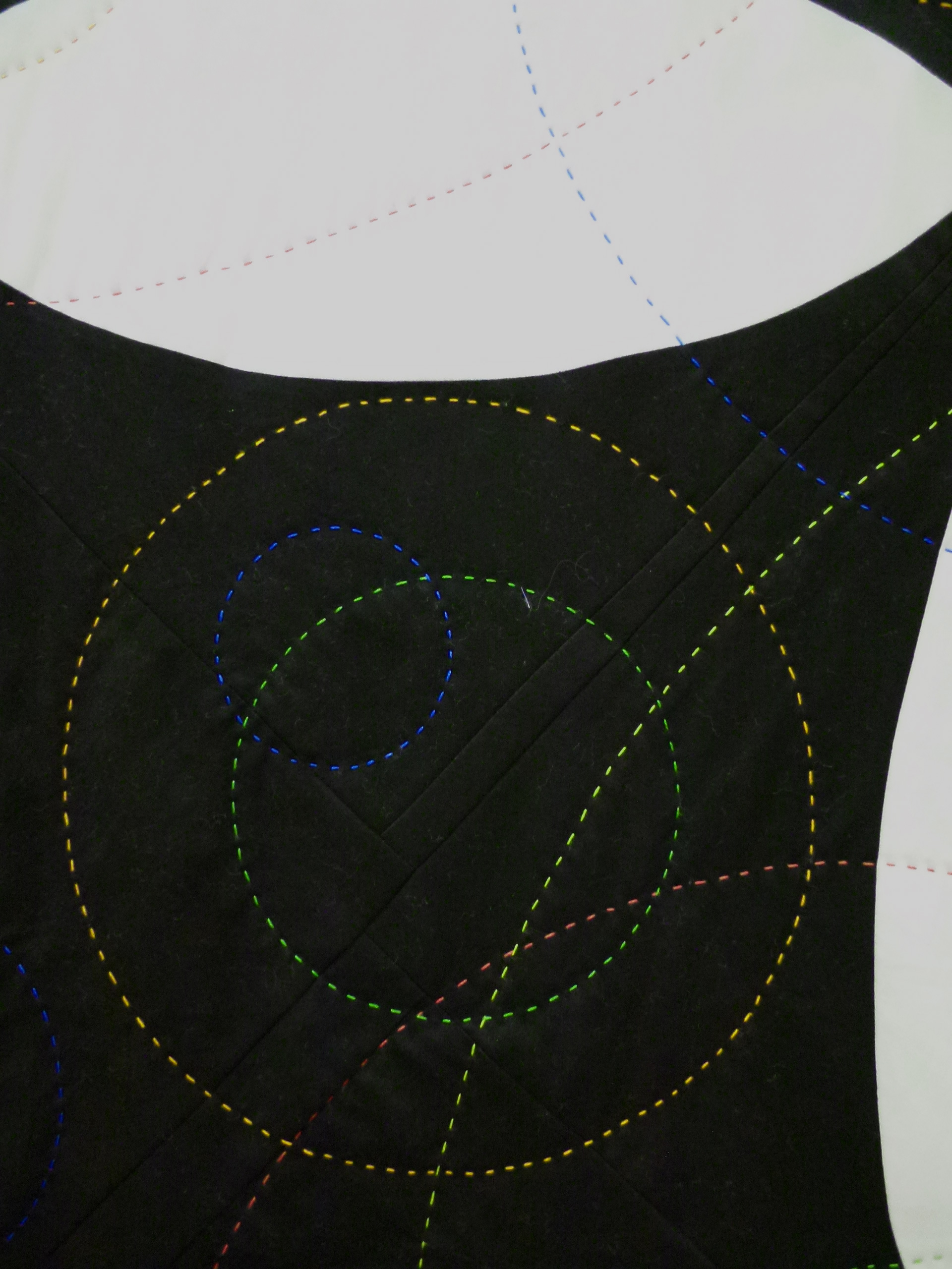
Fill the Void by Cinzia Allocca
First, I was very happy to see that Fill the Void, by Cinzia Allocca, won a prize in the handwork category. This was one of my favorite quilts at the Vermont Quilt Festival last year, and the hand quilting really is beautiful.
I was happy to see some of my friends’ quilts in the show. Here is Jean with hers:

Jean Larson with “Floating”, her QuiltCon show entry
And here is Amy’s entry in the Michael Miller spring challenge.

The New New, by Amy Anderson
That really WAS a challenge for most of us who don’t often use pastels, but Amy met the challenge with a nice design, so I was glad to see it at the show.
There were several quilts that obviously drew from mid century modern art, though that was not referenced in the show notes. Here are two designs that were especially striking. They are Ethos by Natasa McFadyen and Amazonia by Nathalie Bearden.


To me, these look like mid-20th Century art, especially Mark Rothko.
There were several quilts that drew on common forms from mid-century graphic design. I thought this one was fun:
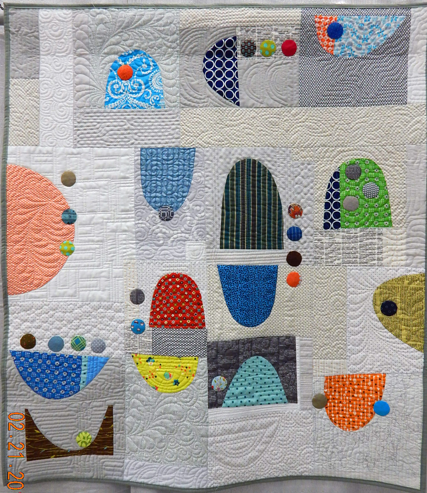
Bowls and Balls #2, by Rachel Kerley
Finally, I loved this quilt by Luke Haynes, which he frankly states is a re-working of the Andrew Wyeth painting “Christina’s World”. It’s a great example of how good design is good design, regardless of the medium. I particularly like that, although he has changed a number of details to make it his own, the reference is immediately recognizable to anyone who knows the original painting.

{The American Context #16} Christina’s World, by Luke Haynes
In view of a lot of this, I was interested to see in the newsletter from one of the modern guilds that they want to focus on “modern quilts, not art quilts”. Obviously the definition of “modern quilt” isn’t yet settled despite much discussion.


These are some of the best ones I’ve seen. Thanks for sharing them.
Thanks for looking. The show was quite diverse, even though a few of the quilts got most of the publicity. Some of the quilts were panto quilted, which surprised me.
Thanks for sharing! I like seeing the quilt of the Wyeth painting.
Yes, it is amazing! Thanks for reading. Be well.
Thanks for sharing your thoughts on Quiltcon! I agree with you, the definition of modern quilting isn’t really well defined, now is it? I kind of like it fluid and not set in stone!
I like it kind of undefined, too. Part of the appeal of modern quilting to me is that most folks are less judgmental about other people’s quilts. At least at Asheville MQG we like to say “we try not to have too many rules”, which encourages creativity. Thanks for commenting!
I’ve enjoyed the variety of reactions to QuiltCon. I agree that Modern Quilting is a moving target. I went through a phase of trying to define it and do it; now I don’t so much. I doubt I’ll ever be a mover-and-shaker, so my quilts will always be ‘oh so last year.’ Still, I have fun.
And having fun is really the whole point, so go for it! I’m not sure I even want to be a “mover-and-shaker”. It takes too much energy away from having fun 🙂